Numbers in Science: What every journalist and politician should know (part 2 of 3)
As you read this Substack version please keep in mind that subscripts and superscripts were not displayed after uploading.
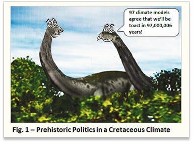
In his popular book A Mathematician Reads the Newspaper, John Allen Paulos tells a story about a museum guard who told a group of visitors that the age of the dinosaur skeleton on display was 97,000,006 years old. Asked how he knew that, the guard replied, “When I started working at the museum six years ago, I was told the dinosaur skeleton was 97 million years old.”
Paulos uses this humorous story [1], along with many others, to point out that a lot of people don’t know whether the numerical answers to simple calculations are meaningful. He calls this pervasive problem “innumeracy” and he attributes its proliferation to the lack of hygienic journalism [2].
Sometimes innumeracy is very specific, like believing numbers with more digits are more accurate than those with fewer digits. On other occasions, it takes the form of vague, ambiguous numbers that have multiple interpretations because of incomplete or inadequate information describing those numbers [3].
Most of the time numerical ambiguities receive little attention, such as the contested counting of recycled aluminum cans or the weighing of all the world’s ants by the Bees, Wasps, and Ants Recording Society. However, numerical ambiguity occasionally can create serious consequences, like the time some pesky lawyers capitalized upon ambiguity to manipulate a bank out of $693,000.
Scientists have avoided many of the problems associated with ambiguous numbers and innumeracy simply because they have developed standard procedures for their calculations and experimental measurements [4]. These standards make it easier for scientists to compare their results to theoretical predictions and to reliably repeat and verify the results of other scientists.
Climate practitioners, however, treat numbers very differently from the way scientists treat numbers, because climate research is highly politicized [5]. Before examining a few typical climate numbers with respect to the standards used by scientists, it’s worthwhile to briefly review some of the basic numerical procedures used by scientists.
The Basics: Averages and Uncertainties
Calculating an arithmetic average for a set of individual measurements is a fundamental exercise given to students in elementary physics and chemistry laboratory courses. A typical problem might be, for example, “If a person steps on and off a bathroom scale five times producing readings of 154.6 lb, 153.2 lb, 151.0 lb, 152.5 lb, and 152.3 lb, what is the average weight of the person, correctly rounded?
The computed average weight, after rounding to four significant figures, is 152.7 lb. However, that is not the correct answer, because the recorded measurements are changing in the ones place, not the tenths place as displayed by the bathroom scale. The standard practice, as shown in Fig. 2, is to write an experimental measurement or a calculated result so only the final digit is uncertain. That means the correct answer for the average is 153 lb, not 152.7 lb.
The spread in the data provides a sense of reliability to the measured experimental result, which is written as 153 ± 2 lb. The uncertainty of ± 2 lb represents the expectation that all (or nearly all) of any new, additionally measured values will also fall between 151 lb and 155 lb [6].
Unfortunately, uncertainty and error are often used interchangeably by climate researchers, even though they are not the same thing. Uncertainty is a quantitative indicator of the quality of an experimental result and is related to the spread of data (precision). Error is related to the true or accepted value of a measurement (accuracy). The standard practice is that a reported uncertainty should account for the both the accuracy and the precision of a data point so that the true value lies within the spread of the data.
Reporting the uncertainty associated with experimental results is very important, and great care is required to extract information buried within a large uncertainty. The best way to minimize uncertainty, however, is to begin with a well-designed experiment, which is not always easy to do.
Climate Example #1: The Hunt for E. Coli
Many journalists and politicians believe that carbon dioxide increases are responsible for rising sea levels. They know this to be true because the government’s climate experts have been spying on the oceans using satellites orbiting more than 800 miles above the earth’s surface.
A recent paper in the Survey of Geophysics reviewed the accuracy of satellite methods used to determine global mean sea levels, and it reports (see Fig. 3) a trend line with a negative slope of 0.0208 mm/year [7]. Most scientists would immediately question the implied uncertainty from the last digit “8” in this climate number, because 0.0008 mm (800 nm) is smaller than the length of the common bacterium, E. coli.
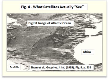
Can satellites and software detect microbes while spying on the oceans? A digital satellite view of the Atlantic Ocean in Fig. 4 shows the ocean surface varies by as much as many meters, making it quite lumpy bumpy. There’s no E. coli to be “seen” in there.
While the journalists and politicians may believe it’s possible to hunt for microbes using a laptop armed with Google Earth, the ocean images obtained from satellites show otherwise. That’s why climate experts publishing a number like 0.0208 mm/year is not a whole lot different than a fictional museum guard saying the age of a dinosaur skeleton is 97,000,006 years.
The Basics II: Calculated Averages Don’t Exist in the Real World
Take a look at the numbers used to calculate the average from the bathroom scale readings in the example displayed in Fig. 2. Notice that none of the readings match the average (152.7 lb before rounding due to uncertainty considerations), which is an observed characteristic for most calculated averages. In other words, calculated averages don’t exist in the real world [8].
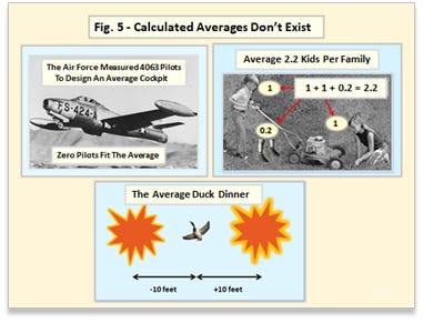
Government statisticians discovered this in the 1950’s when they “measured” 4063 pilots to design an average cockpit for the newly developed jet powered fighter planes. Not a single pilot could fit into the average cockpit (original report here).
For a long time, the average American family supposedly had an average of 2.2 kids. It’s easy to visualize what 2 kids look like, because whole integer kids are everywhere. However, there are no 0.2 kids roaming about the playgrounds and sandboxes. Maybe they’re hiding deep in the oceans along with that climate desperado, global warming.
And finally, there’s the standard story about the two government statisticians who go duck hunting while on vacation [9]. One always shoots 10 feet to the left while the other always shoots 10 feet to the right, and the duck always flies away unharmed. With a lot of government statisticians morphing into climate experts these days, more than 97% of them now use the standard duck hunting model to confirm with 99% confidence that they bagged the duck.
Of course, there are exceptions. Mass production intentionally produces items so they are all nearly the same, and manufactured paper is a good example. An individual sheet in a ream of paper will have a measured thickness that is close to the calculated average thickness [10]. With increasing measurement accuracy, however, even the individual measurements for a manufactured distribution, like the paper sheets in a ream, will no longer be close to the calculated average.
Calculated averages are very ambiguous numbers, and great care is required when using them. Just because grandma always cooks a real duck dinner doesn’t mean that the average duck dinner is real.
Climate Example #2 – The Climate Sun
The mother of all climate averages is the climate sun, which illuminates the earth’s surface with an average 240 W/m2 (watts per meter squared). If that number represents reality, as the climate model people want you to believe, then the climate sun shines 24/7 with no night or day, and it is identical at every place on the surface of the earth. With a wonder number like that, who could possibly object to using solar cells?
One of the reasons the climate sun is so readily accepted is that it’s easily calculated from a simple geometrical average. To find it, take the ratio of the area of an illuminated disk of incoming sunlight projecting onto the earth (πR2) to the total surface area of the earth (4πR2). Throw in an average albedo and you get an average surface illumination of the earth by the climate sun as shown in Fig. 6.
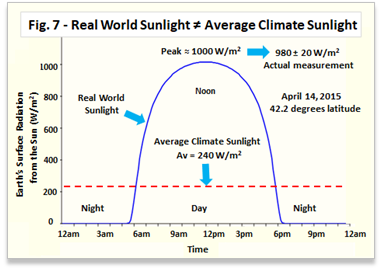
The removal of reality by the averaging process is immediately noticeable. The real, measured sunlight of 1360 W/m2 becomes an average non-real, non-measurable 340 W/m2 above the earth’s atmosphere. At the earth’s surface, the real-world variation from zero to 1000 W/m2 (in the northern latitudes) becomes a constant non-real, non-measurable 240 W/m2.
Scientists, unlike climate practitioners, make measurements to determine what is real and what is not. Anyone can easily compare the average climate sunlight to reality (see Fig. 7) by using the calculator at this site [11]. Better yet, make the measurements yourself using a piece a flat black painted glass and a handheld IR thermometer [12].
In the real world, the dark side of the earth has no sunlight, but on the illuminated side, the sunlight increases until reaching a peak value around noon, before decreasing back to zero in the evening. Like a broken clock, the climate sun only matches up with reality twice a day.
In addition, the average climate sunlight that produces the average global surface temperature (about 14 to 14.5 o C) completely removes the observed diurnal variations in the real-world temperatures of the air, soil, and water. This is demonstrated in Fig. 8, which compares the graph of the average global surface temperature to the graphs of measured air and soil temperatures (no large body of water was nearby, so no water measurements could be made) [13]. The air and soil temperatures in Fig. 8 were measured simultaneously with the real sunlight changes that were graphed in Fig. 7.
One climate practitioner, Kevin Trenberth, pointed out the obvious differences between the effects of the real-world sun and those for the average climate sun in the Community Climate System Model (CCSM) at the American Meteorological Society (AMS) 14th Symposium in 2003.
That’s what happens when you average reality away. If you didn’t take the diurnal cycle out of the real world to begin with, you wouldn’t have to address it not being there afterwards.
Science Data vs Climate Data
The fundamental precept of scientific data is that original data is never altered, adjusted, erased, or fabricated for any reason. In the academic world, scientific reputations used to be built upon adhering to this precept [14, 15]. In the industrial world, the fate of an important patent may hinge on the results of an exhaustive examination of the original data used for the patent application [16].
A corollary to the fundamental precept of scientific data is that theories and hypotheses come and go in science, but good, unambiguous data lasts forever. If there are incessant arguments over the data, then there is something wrong with the data, the experiment, or both. If an experiment is repeated and the original data is unambiguous, then the new data set will be within the uncertainties of both the old and new sets of data.
A good example of data preservation and a subsequent re-examination was Mendel’s data collected on garden peas for his genetic experiments (see also here). The so-called Mendel-Fisher controversy was one of the first attempts to use statistics to dismiss real-world measurements. If Mendel’s original data had been changed, then it would never have been possible to re-examine and validate his work [17].
Almost all of the climate “data” isn’t data at all, but highly ambiguous, calculated results that are made up and adjusted often, usually outside of poorly defined uncertainties. Today’s climate “data” has become a lot like the constantly changing information in the former Soviet Union where it was not possible predict the past. How many times must the temperature anomalies for 1880 be adjusted until they are correct?
Pick any climate graph from a climate studies publication, and it will probably look like one of those typical climate graphs shown in Fig. 10 (taken from actual publications). Somehow, from these rather messy climate graphs, we’re supposed to believe in things like satellites can “see” microbes floating on the surface of the ocean. The highly ambiguous climate data is easily interpreted (or challenged) by simply re-adjusting “how you decide to count,” as the hypothetical trend lines represented by A, B, and C illustrate in Fig. 10.
In order to promote their climate propaganda programs, certain politicians and climate practitioners want people to accept things that aren’t so. By replacing real-world observations with non-existent calculated averages, they are trying to force people into believing that the average duck dinner is real.
That’s why climate practitioners use the non-real “real” climate sun instead of the “non-real” real sun. That’s why they use “real” temperature anomalies instead of “non-real” real temperatures. On and on it goes … A wrong number becomes correct because the correct number doesn’t match the wrong number. If it’s good enough for Donald Rumsfeld, then it must be good enough for climate.
Unlike the climate practitioners, and fortunately for everyone, scientists rely only on unambiguously measured data. And they don’t make fantastic claims about things they don’t understand.
About:
C. R. Dickson studied physics and chemistry and received his Ph.D. from Columbia University as a George B. Pegram Distinguished Fellow. He has worked for Polaroid, Allied Chemical, RCA, and the Solarex Thin Film Division, a solar cell company formed as an RCA technology spinoff. He also served as a scientific advisor to the United Nations Industrial Development Organization (UNIDO) in Vienna, to the Indian Association for the Cultivation of Science (IACS) in Calcutta (Kolkata), and to Bharat Heavy Electricals Ltd. (BHEL) in New Delhi.
Notes:
1. Paulos used 90 million years in his story, but a government expert homogenized the 90 million into 97 million turning 90,000,006 years into 97,000,006 years.
2. An example of news media and numerical ambiguity: A well-known TV news anchor narrated a series following a high school class graduating in 2000, the “first year of the 21st century.” When it was pointed out that the year 2000 was the last year of the 20th century, the news anchor replied in a very matter of fact tone, “It’s all a matter of how you decide to count.”
3. A definition of an ambiguous number is given by the Wolfram MathWorld site. An example of arithmetic ambiguity created by a lack of parentheses.
4. Here are some references about accuracy, precision, error, and uncertainty: 1) Advanced Instructional Systems, Inc. and the University of North Carolina, Measurements and Error Analysis, 2) Henrion and Fischhoff , Assessing Uncertainty in physical constants, American Journal of Physics 54, 791 (1986), and 3) Churchill Eisenhart, Expression of the Uncertainties of Final Results, Science 14 Jun 1968:Vol. 160, Issue 3833, pp. 1201-1204 ( pay to view or use SciHub with doi:10.1126/science.160.3833.1201).
5. The lack of standards by journalists and politicians is readily apparent from the reporting of numbers for the current Great Plague.
6. The uncertainty will be greater than ± 2 lb if it is calculated as a confidence interval based on Student’s t-distribution used for very small sample sizes.
7. The link to Ablain et al., Surv. Geophys., (2016) is pay to view (or use doi:10.1007/s10712-016-9389-8 with SciHub).
8. There are naturally occurring averages like elemental atomic masses which are mass weighted averages obtained from the natural abundance of the isotopes for each element. That is why atomic masses (except for the carbon-12 isotope) are not whole numbers. It can be argued that a specific temperature measurement is an average. However, like the abundance of isotopes, it is a result of a natural “mixture” that usually produces a repeatable measurement. The boiling point or freezing point of water always occurs at the same temperature when measured under identical conditions. Calculated man-made averages generally are not representations of reality.
9. Adapted from E. L. Bauer’s illustrative example explaining the difference between accuracy and precision on p. 6 in his book, A Statistical Manual for Chemists, Acad. Press. 2nd Ed., 1971.
10. To obtain the average thickness of a sheet of paper in a ream, measure the thickness of the ream (500 sheets) and divide by 500. The result compares very nicely with measurements made on an individual sheet using a micrometer.
11. Although the solar insolation calculator is verified by real measurements, the limitations for applications by the user are pointed out at the site (for example, it’s not intended to represent solar insolation in the middle of a snow blizzard).
12. Bell labs provided a “make your own” single crystal silicon solar cell kit for school kids in the early 1960’s. The instruction book had a simple method to measure the solar insolation by measuring the temperature increase with time for some water in a petri dish. A simpler version of the same experiment uses a flat black painted piece of glass to absorb the sun’s rays.
13. The continuous temperature measurements in Fig. 8 were made using an IBM laptop and some inexpensive high school A/D laboratory equipment (Vernier GoLink connected to Vernier thermocouples in stainless steel sheaths).
14. A Nobel Prize winner at Cal Tech, Frances Arnold, retracted one of her recent papers because the work could not be replicated. “Careful examination of the first author's lab notebook revealed missing contemporaneous entries and raw data for key experiments.”
15. The recent statistical plague surrounding the current Great Plague from China virus was summed up succinctly in the Science article discussion about retracted papers (last sentence in article): “If you’re a scientist and you’re going to sign on to a project, by God you should know what the data are.”
16. Gordon Gould was eventually granted a patent for a laser, but only after a long legal battle, and only on specific parts of the laser. One of the reasons for his difficulties was that he did not demonstrate “a reduction to practice” until long after many working lasers had already been reported in the scientific literature and in other patent applications. It’s always easy to get something to work after somebody else has already done it.
17. Bad data and mistakes, if recorded in a laboratory notebook, should be retained with an explanation. Sometimes mistakes or wrong answers turn out to be correct or they lead to new discoveries upon investigating why the answer was wrong.
18. All figures are original and may contain parts adapted from Wikimedia Commons.


Thanks for the post on known unkowns. AS many, including Briggs, rightfully say the models are only as good as their initial assumptions and conditions. Also liked your emphasis on the goodness of data, which is most relevant in today's AI world (garbage-in/garbage-out).