Revisiting NASA GISS Temperature

Graph vs. Graph = Political Journalism
This is an old post from WUWT that contains some important basics about the politics of climate and NASA’s tabulated average “temperatures” and temperature anomalies. There is a Post Script that discusses the changes NASA made in its tables after this post appeared and some additional viewpoints of NASA tabulations of “data.”
Guest essay by C.R. Dickson
Most people have no trouble relating to temperature, because they use it every day when they set the thermostat in their homes, adjust the temperature dial on an oven, or watch a weather report on TV. On the other hand, practically no one recognizes a temperature anomaly, the yardstick for measuring man-made global warming. That’s because outside of climate studies, no one uses it.
A temperature anomaly is the difference obtained by subtracting an average temperature from real temperature data. Climate studies work with anomalies instead of real temperatures because anomalies are assumed to be more accurate over large geographical areas (see note 1). The rapidly rising graphs of temperature anomalies also conveniently dramatize catastrophic global warming.
So it’s easy to see why a few journalists made a big fuss over a very flat looking graph of average global temperatures posted in a tweet from the National Review. The graph in Figure 1 below (see notes 2 and 3) is like the one displayed in the tweet.

This graph supposedly hides global warming because the small increases in temperatures aren’t obvious. An online article in The Huffington Post stated it was an improper visualization that makes “just about anything seem stagnant,” and The Fix at The Washington Post complained that “it is misleading” because it “hides the actual change in temperatures.” Also online, Business Insider said the graph zooms “out so much that it makes it seem like global average temperatures haven’t changed at all.”
Of course, the journalists decided the temperature graph was up to no good, and they countered with their own graphs of the national debt and the Dow Jones Industrial Averages. It was graph vs. graph on the way to the world’s end.
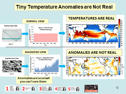
With a bit of an effort, it’s easy to discover that the temperature changes are identical for both global temperature anomalies and for global temperatures (see note 4). The difference is that the graph of the anomalies is a magnified view, not a normal one.
Magnification doesn’t change the object you are viewing; it just lets you see more details. A blood cell or a microbe doesn’t get any bigger when it’s magnified; it only looks larger.
For example, the normal view of a piece of glass shown in Figure 2 appears to be very smooth. As can be seen in Figure 3, the magnified view has numerous peaks and valleys making the surface look rough, not smooth. Although the imperfections seem larger in the magnified view, they are the same size as in the normal view.

The same thing happens with reconstructed temperatures and temperature anomalies. When you magnify the average global temperatures in Figure 4, the unseen changes become visible, as Figure 5 clearly shows.

Fortunately, people normally do not use a magnified version of the world to proceed with their daily lives. That’s why no one drives down a highway guided by a microscope magnifying the road’s surface. For the same reason, weather forecasters use the real temperatures instead of magnified temperature anomalies.
Because it’s so difficult to observe man-made global warming, some experts at NASA GISS believe the accuracy of climate models requires a one hundredfold increase in order to see the small amount of warming.
“A doubling in atmospheric carbon dioxide (CO2), predicted to take place in the next 50 to 100 years, is expected to change the radiation balance at the surface by only about 2 percent. If a 2 percent change is that important, then a climate model to be useful must be accurate to something like 0.25%. Thus today’s models must be improved by about a hundredfold in accuracy, a very challenging task.”
A paper by Graeme Stephens et al. in Nature Geoscience also shows how hard it is to find global warming. They reported the uncertainty in the earth’s warming imbalance as 0.6 watts per m2 ± 17 watts per m2. The enormously large uncertainty in this very small number means that it is difficult, if not impossible, to observe. Just like NASA said it was!

But how small is this imbalance? It’s only 0.06 percent of the 1,000 watts per m2 of sunlight falling on the earth’s surface at noon. Another interesting comparison is that 0.6 watts per m2 is like a small AA battery discharging over a few hours (see Figure 5 for picture and Note 5 for calculation). Consider this: Little batteries that turn on televisions do not power hurricanes.
Small numbers with large error bars, combined with excessive averaging, is a recipe for ambiguous results. The reaction to the temperature graph is a perfect example of how political motivations can twist ambiguities into disagreements. Confusion is created by using temperature as if it were the same as an anomaly, but somehow the temperature graph is misleading while the anomaly graph is not. What is hidden is the fact that both graphs display no real temperature data.
Fortunately, unambiguous data is the cornerstone of scientific research. If independent researchers cannot obtain the same answer, then there is something wrong with the data, the experiment, or both. Speculations, theories, and hypotheses come and go in science, but good data lasts forever. That is why catastrophic man-made global warming, like all consensus “science,” will eventually go the way of phlogiston, spontaneous generation, and luminiferous ether.
NOTES:
1. Hansen et al. discusses using anomalies instead of actual temperatures, and there is some limited information on errors. Hansen also complains about talk shows, politics, public perception, and the news media on pages 20-23. Real Climate talks about temperature and anomalies and for additional discussions go here, here, and here.
2. The graph in the tweet showed up in a WUWT comment here. Additional comments led to this site . The graphs in Figures 1, 4, and 5 are in degrees Fahrenheit because that’s what the National Review graph used.
3. The NASA GISS tabulated values were updated in the process of making the above graphs. A large number of historical values were changed without explanation making the tabulated values a moving target.
4. To create temperature anomalies NASA GISS takes real-world temperatures and subtracts a subjective “best estimate for the global mean for 1951-1980,” which is calculated to be 14 degrees Celsius, or 52.7 degrees Fahrenheit. The temperature changes (ΔT) for both graphs are the same because one graph is offset from the other by a constant 52.7 degrees F.
5. The solar irradiance is for AM 1.5 (approximately 48.2 degrees zenith). A value of 3.9 watt hour (14 kilojoules maximum energy) is typical for 1.5 volt AA battery discharging at a 50 mA drain. (0.6 watts / m2) x (6.5 hour) = 3.9 watt hour / m2.
ABOUT:
C. R. Dickson is a retired chemist and physicist with a Ph.D. from Columbia University. He has worked for Polaroid, Allied Chemical, RCA, and the Solarex Thin Film Division, a solar cell company formed as an RCA technology spinoff. He also served as a scientific advisor to the United Nations Industrial Development Organization in Vienna, Austria.
To read the article at WUWT that includes 258 comments go here:
https://wattsupwiththat.com/2016/01/11/graph-vs-graph-political-journalism/
Post Script this is a work in progress that remains incomplete
What NASA reports in their tables is not data and it is not real temperatures. NASA reports temperature anomalies and average temperatures (monthly) averaged over the entire world. An average temperature over the whole world that mixes air parcels with different humidities and/or mixed with sea surface (water) temperatures is a meaningless number. It is like finding an average height of all the world’s trees averaged together with all the heights of all the world’s buildings..
It is interesting that NASA GISS eliminated the recipe to convert temperature anomalies to “absolute” temperatures, always given at the end their tabulations of “data” for calculated temperature anomalies (which, of course, is not data). This recipe simply took the temperature anomalies and added the 30 year average reference temperature to an individual anomaly to recover the absolute temperature scale which, of course, is neither a real temperature or real data, but a calculated result. This is the source of the flat graph that caused so much consternation among the journalists because it indicated that there was little or no global warming, unlike the graphs of the anomalies displayed. Clearly, NASA GISS did not want people to see this recipe and continue to make graphs and the recipe was eliminated right after the WUWT article appeared. No information was eliminated because the 30 year mean was still available and the ability to make a graph remained, but it was no longer obvious.
This is precisely how Stalinist communism worked, much like the disappearance of Nikolai Yehzhov in the classic photo. See the comparison below:


Temperature anomalies and average temperatures are quite different. Notice that the increases in temperature anomalies do not match the increases in average temperatures.

The following illustrations and graphs are from Tiny Heller’s website and are very telling.